Let’s revamp Claus Raasted’s Website 

In the evolving landscape of web design, creating a visually appealing and user-friendly website is paramount to capturing and retaining visitor interest. Recently, I undertook a comprehensive critique and redesign of Claus Raasted’s website, focusing on improving its visual hierarchy, color scheme, typography, user experience, and overall content structure. This blog post outlines the key insights and proposed changes that can significantly enhance the site’s effectiveness and user engagement.
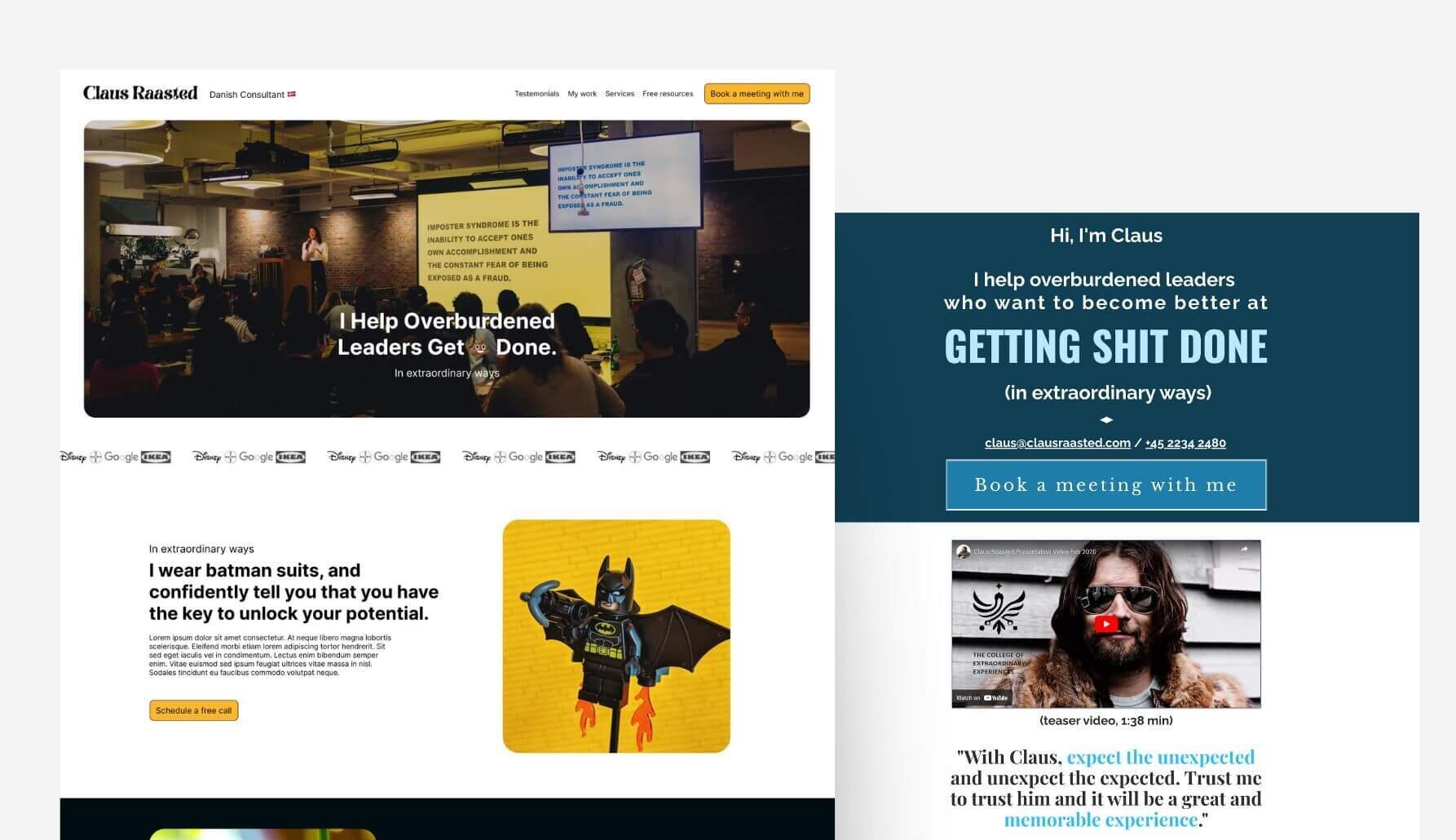
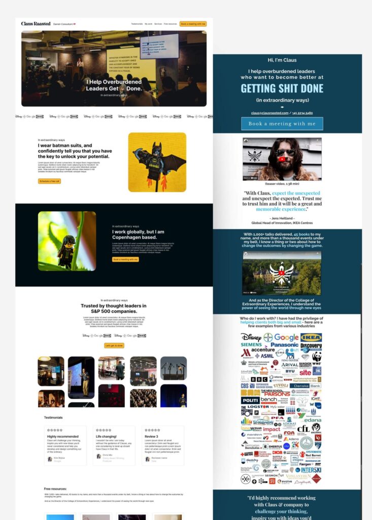
First here is the current design of Claus Raasted’s website, make sure to check it out: https://clausraasted.com
Here’s a breakdown of what needs to be improved:
Website Redesign Case Study: Transforming Claus Raasted’s Online Presence
In today’s digital landscape, a website serves as both a professional’s portfolio and a primary engagement tool for potential clients. Claus Raasted’s current website, though functional, falls short in key areas of visual engagement, user experience, and overall design cohesiveness. Below, I’ll discuss the challenges I identified on the site and offer targeted suggestions for improvement.
1. Lack of Visual Engagement
Monotone Color Scheme: The current design heavily relies on dark blue backgrounds with white text, creating a dull and uninspired atmosphere. While the minimalist aesthetic may be intentional, the absence of contrasting colors or dynamic elements causes the site to feel flat. For a brand aiming to showcase Claus’s dynamic and high-energy personality, this visual design doesn’t reflect that vibrancy.
Overuse of Whitespace: While whitespace is often praised for enhancing readability, the overabundance of it here creates an impression of incompleteness. Instead of exuding modern elegance, the excessive spacing makes the site feel unfinished.
To fix this: Reducing the empty spaces and thoughtfully balancing the layout with engaging visual content will give the site a fuller, more polished feel, this should be achieved by unified typography. Moreover, since Claus’ brand is a vibrant and more of a “Rebel Archetype” and promotes this rock-star “vibe” we should be introducing complementary accent colors for call-to-action (CTA) buttons and key sections could break the monotony and invite engagement.
2. Poor Content Hierarchy
Disjointed Flow: The structure of the content lacks coherence. Visitors are faced with scattered testimonials, logos, and quotes with no clear narrative guiding them through the site. Without a cohesive story or logical content flow, users may feel confused or disoriented, struggling to understand Claus’s value proposition.
Missing Visual Breaks: Currently, there are few visual cues to separate sections, making it hard for users to distinguish between different types of content.
To fix this: A redesign that introduces clear content progression, taking users through Claus’s story, services, and credibility, would create a more compelling and engaging experience. Even if it’s a one page / landing page website, we should implement a navigation at the top or bottom of the screen to guide the user through the process. Simple design elements like section dividers, color changes, or even icons would help guide the user’s eye and create a more digestible and organized flow of information.
3. Overwhelming Logo Section
Cluttered and Confusing: The logo section, meant to highlight partnerships or accomplishments, ends up overwhelming the user due to its cluttered presentation. There’s no clear hierarchy or organization, which makes it difficult for users to process the value of the companies represented.
To fix this: You can still use a modern layout or slider to elegantly showcase your logos. Instead of a wall of logos, fewer, more meaningful logos with context or case studies would provide users with clear, relatable proof of Claus’s expertise and partnerships.
4. Weak Call-to-Actions (CTAs)
Repetitive and Desperate: The “Book a meeting with me” CTA, repeated multiple times throughout the page, comes off as pushy rather than persuasive. By presenting the same message in identical formats, the user experience becomes repetitive and the CTA loses its impact.
Lack of Incentive: There’s no clear explanation of what users stand to gain from booking a meeting. Effective CTAs should communicate value—whether it’s receiving expert advice, solving a specific problem, or gaining unique insights.
To fix this: Varied CTAs that align with the user’s journey, such as “Learn how I can help” or “Explore services,” would be more effective at encouraging engagement. Redesigning the CTAs to better articulate what users will benefit from scheduling a meeting could dramatically improve click-through rates.
5. Inconsistent Imagery
Amateur and Unpolished: The site’s imagery alternates between professional photos and casual snapshots, resulting in a lack of visual consistency. This inconsistency detracts from the overall professionalism of the site, making it feel as though it was assembled hastily rather than thoughtfully curated.
To fix this: Use consistent, high-quality images that align with Claus’s personal brand would create a more polished, cohesive visual identity.
6. Outdated Design Aesthetics
Lack of Modern Elements: The overall design feels outdated, with no use of modern web design trends like subtle animations, parallax scrolling, or interactive elements. These design features are now standard in creating dynamic and engaging user experiences.
Flat and Static: The website feels more like a static document than an interactive, engaging platform. Without dynamic elements to capture attention, it risks being forgettable.
To fix this: By incorporating modern design techniques—like hover effects or smooth transitions—the website could feel more up-to-date and in tune with current user expectations. Introducing interactive components that engage the user—such as hover animations, video embeds, or scroll-triggered effects—could create a more memorable user experience especially animations that can reinforce the Rebel vibe, such as wiggles and unconventional effects.
7. UX Issues
No Clear User Path: Users currently have no clear path to follow as they scroll through the site. The absence of a logical flow or funnel to guide them from awareness to action could lead to a high bounce rate.
Frustrating Scroll Experience: With no sticky navigation bar or anchor links to jump between sections, users are forced to scroll endlessly, which can be frustrating and tiring.
To fix this: Adding a fixed menu or section links would allow users to easily navigate the site, reducing frustration and improving the overall experience. A well-structured site should take users on a journey, leading them naturally from introductory information to service offerings and ultimately to the conversion point.
8. Lack of explanation, just what do you do?
Storytelling through the videos: Storytelling is one of the most effective ways to create an emotional connection and leave a lasting impression, the current site does this nicely… through video. By incorporating Claus’s journey, mission, and value proposition into a well-crafted story in text format, the site could draw users in using SEO, make an emotional connection, and provide a clearer understanding of why Claus is the right person to work with.
9. General ideas
- Start a Newsletter: Given your strong presence on LinkedIn and your extensive experience as an author, starting a newsletter could be a powerful way to further establish your authority. A regular newsletter allows you to share insights, updates, and valuable content directly with your audience, keeping them engaged beyond social media. It’s a great way to build relationships with your followers and position yourself as a thought leader in your field.
- Add a Lead Generation Form to Your Website: Having a form on your website is essential for capturing leads. While some visitors may not be ready to book a meeting immediately, they might still want to connect or learn more. By providing an easy way for them to leave their contact information, you can follow up later. Leads collected directly through your website are particularly valuable since they come from individuals already interested in your services. Make sure the form is simple and inviting, and consider offering a lead magnet, like exclusive content, to encourage sign-ups.
- Offer Free Resources: With over 45 books under your belt, you have a wealth of knowledge that could serve as valuable resources for your audience. Offering some of these books for free on your website is an excellent way to build trust and provide value upfront. Free resources such as eBooks or guides can also act as lead magnets, helping you grow your email list while demonstrating your expertise to potential clients.
- Create a Clear Pricing Structure: A well-defined pricing structure will help streamline the decision-making process for potential clients. Instead of a flexible or negotiable pricing model, consider offering tiered packages that clearly outline the value provided at each level. This transparent pricing approach helps prospects understand what they’re getting and allows them to choose a package that suits their needs and budget. Clear, structured pricing builds trust, eliminates confusion, and makes it easier for potential clients to commit to working with you.
- Reorganize Testimonials for Greater Impact: Rather than scattering testimonials throughout the website, consider placing them directly underneath the section where you describe your services. This layout creates a stronger connection between the services you offer and the positive feedback from previous clients, reinforcing your credibility at a critical moment in the decision-making process. By placing testimonials strategically, you can make them more impactful and help potential clients feel more confident about engaging with you.
Summary
While Claus Raasted’s current website is functional, it lacks the visual engagement, modern design, and user-focused structure needed to stand out in today’s competitive digital landscape. A comprehensive redesign should focus on the following key areas:
- Enhancing Visual Engagement: Introduce a more dynamic color scheme, reduce whitespace, and incorporate modern design trends to create a more vibrant, inviting experience.
- Improving Content Structure: Redefine the content flow and break up sections with visual cues to guide users through the site in a logical, compelling way.
- Refining CTAs: Diversify the call-to-actions with more persuasive messaging that communicates clear value to users.
- Modernizing the Aesthetic: Add interactive elements, consistent high-quality imagery, and modern design features to make the site feel up-to-date and engaging.
- Optimizing the User Experience: Simplify navigation, create clear user paths, and reduce scroll fatigue with a more user-friendly layout.
By implementing these changes, Claus Raasted’s website can evolve from a flat, outdated platform into a dynamic, engaging, and conversion-driven experience that truly reflects his unique brand and value.

If you’d like to view my full design revamp on Figma I have embedded design Figma down here:
